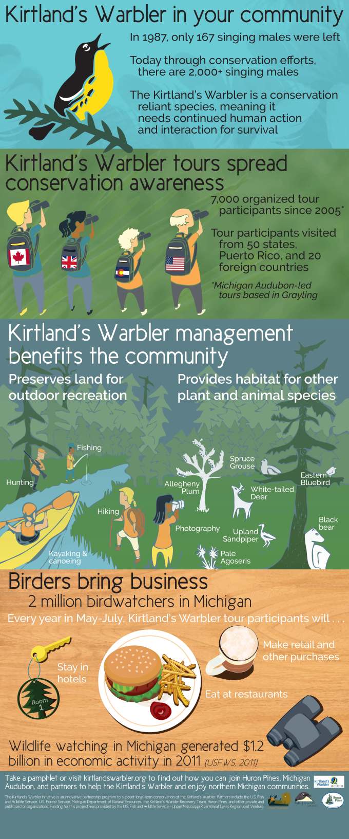
After having created an infographic for use on social media, I was tasked with creating a large format infographic for use on a vinyl 3 x 7 foot banner. This project had a broad audience, as the banners would be displayed at public libraries, so the language and art needed to be accessible to various ages but professional-enough to display for business partners as well. The project had four stages, research, conceptualization, creation, and printing.
For research, I needed to do little on the subject itself. We were partnering with Huron Pines, who focused on conservation of the Kirtland’s Warbler. Our partner and my boss provided me with all of the necessary facts they wishes to include. This done, I focused primarily on the style and design of the banner. Infographics being a growing media, I wanted to create a unique design, but also take cues from other conservation-focused projects. I spent several hours and narrowed down styles and information delivery I liked.
From experience, I’d learned my boss required concrete options to choose from. I split my research into three categories: open-illustration style, segmented with bullet points, and factually focused with charts. I completed some very rough sketches and gathered color choices and some of my inspiration infographics. After presenting this, my boss chose a segmented style and I went from with the design.
The creation involved four main sections for four topics: introduction on the Kirtland’s Warbler, tours and awareness, conservation and community, and commerce benefits. Each section had a unique design and purpose, but had to be cohesive. I kept the section united by colors, fonts, and similar stylizations of the artwork. Each section used multiple programs and involved traditional pencil work, inks, and then digital coloring. My boyfriend, another designer, assisted me by rendering all the people in the banner, which I colored and placed per my sketches. I chose a minimalistic style that would appear streamlined and modern for the business audience, and but also appeal to families.
Although this project had a more focused and organized planning and art stage, I encountered some difficulty with color matching on the vinyl material, as well as with fitting the banners into their stands. Just goes to show that no matter how organized a project can seem, difficulties can always arise in the process.